Cry Baby Cafe Rebrand
Crybaby Café offers a lively and sophisticated atmosphere where patrons can enjoy espresso beverages, delicious cuisine, and a comprehensive selection of beverages, from the crack of dawn until late into the night, seven days a week.
Since Cry Baby is a fresh addition to Pullman, encompassing not just nightlife but also daytime offerings, I sought to elevate their brand through a logo, color palette, and font revamp. This rebrand centers on an earthy aesthetic, featuring bold fonts and a touch of terracotta for an added pop of color. The new Cry Baby logo cleverly combines a coffee cup and a martini glass, providing customers with insight into the diverse services they offer throughout the day and night.


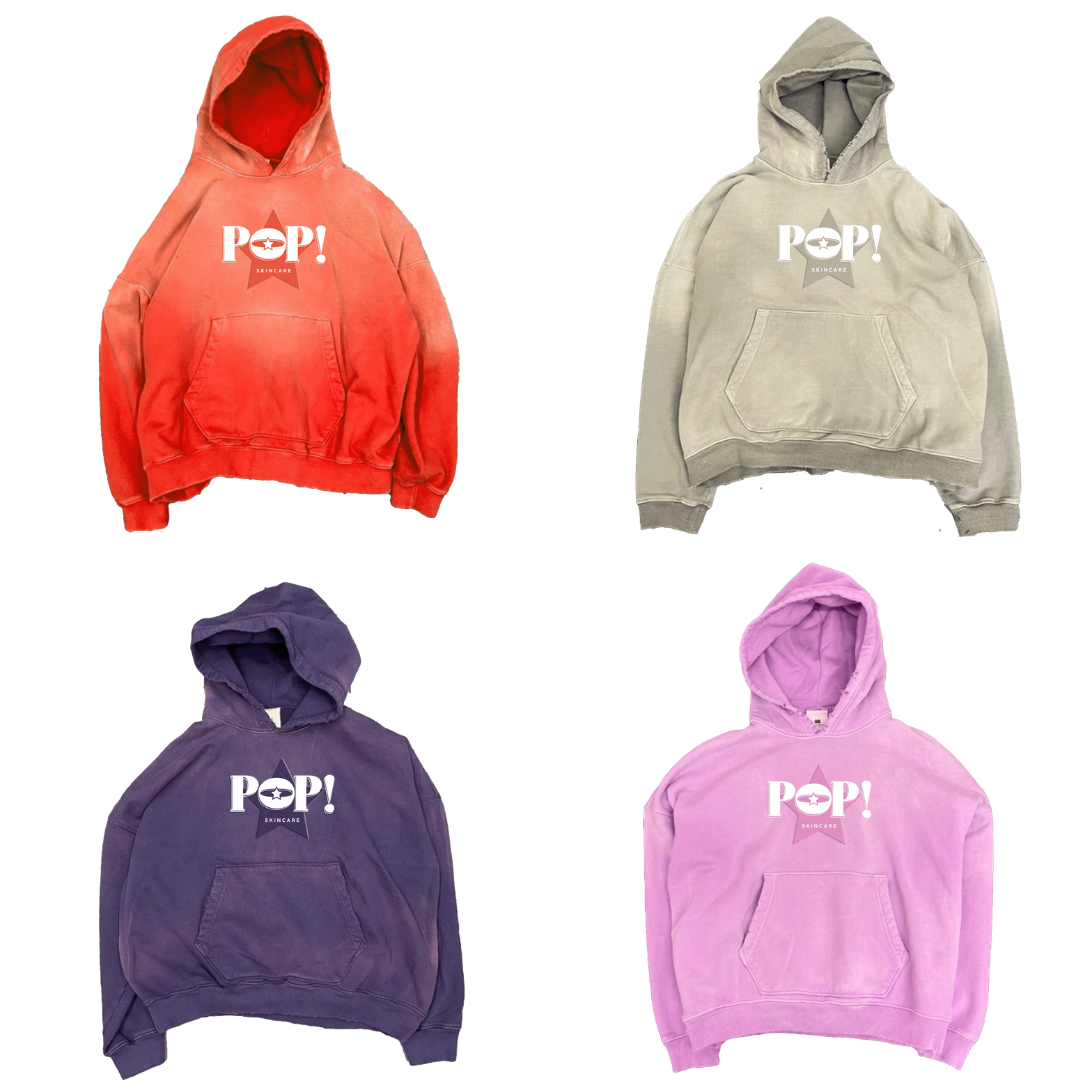
Pop! Skincare Brand Identity
Introducing "Pop! Skincare" – a vibrant fusion of style and substance in the realm of skincare. Showcasing a palette of pinks, white, and black, our brand embodies a balance of sophistication and playfulness. At the heart of our identity lies the star icon, symbolizing our commitment to illuminating beauty from within.
With an eye for aesthetics, we curate fonts that resonate with contemporary trends, ensuring our presence captivates wherever it shines. "Pop! Skincare" is more than just a routine; it's a celebration of individuality and self-expression. Join us on a journey where skincare meets artistry, and every application becomes a moment of empowerment.


RUNNING MAN CAFÉ
RUNNING MAN CAFÉ
The decision to rebrand The Running Man Cafe stemmed from a coffee shop client seeking a logo makeover that appeals to energetic, active individuals seeking a convenient pitstop for coffee and a delicious bite. This rebrand. For this rebrand, I aimed to incorporate vivid hues, natural motifs, and dynamic shapes, alongside striking fonts that catch the eye from a distance.


